
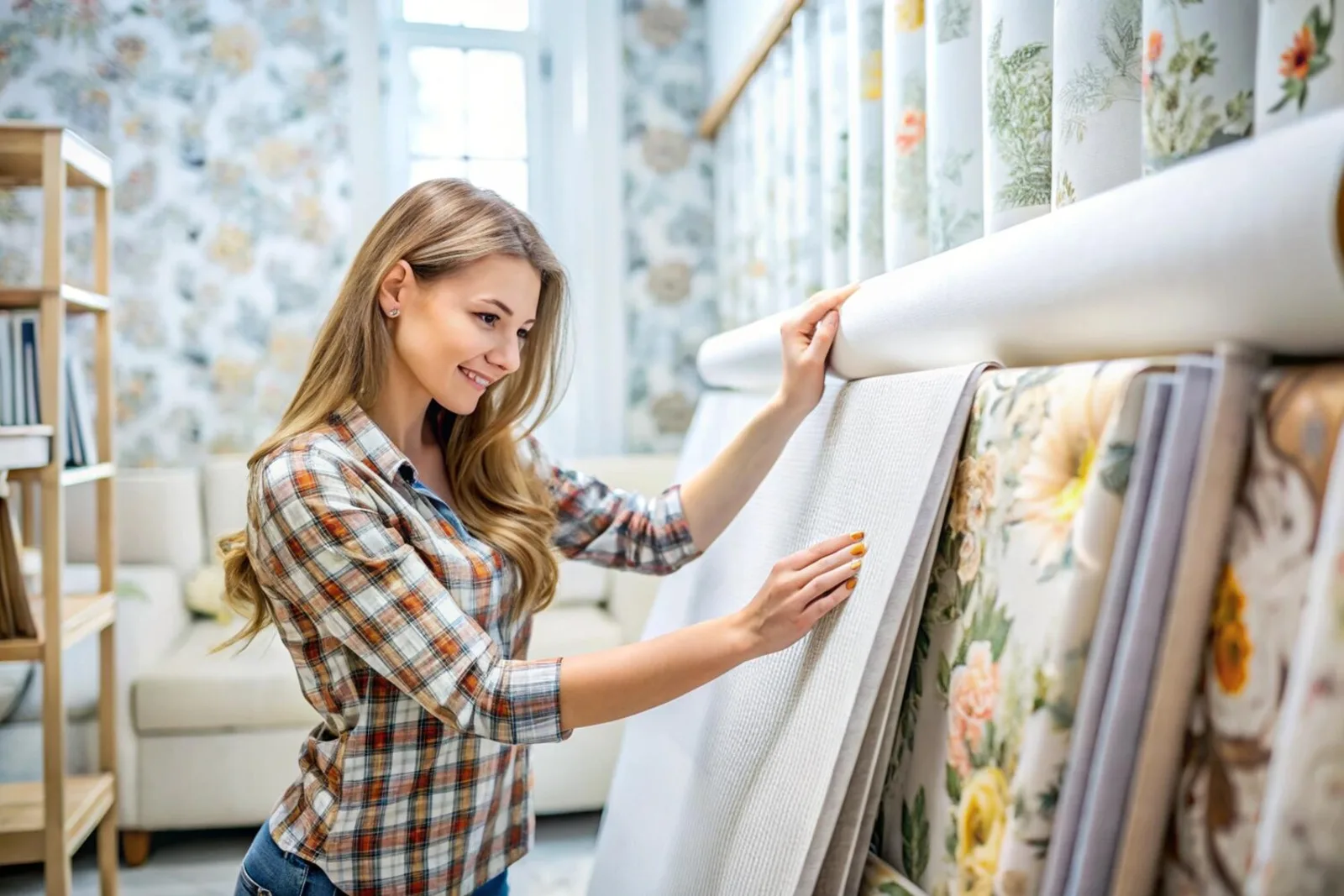
Wallpaper Trends for 2025: Colors, Textures, and Patterns on the Rise
Discover how to choose wallpaper that sets mood, adds depth, and refreshes your home. This guide covers the leading Wallpaper Trends for 2025: Colors, Textures, and Patterns on the Rise — from calming neutrals to bold botanicals, tactile surfaces, and sustainable materials.
Key takeaways
- Warm earthy neutrals create calm, cozy spaces.
- Textured and 3D wallpapers add tactile depth and hide wear.
- Jewel tones and warm greens make striking accent walls.
- Metallic and pearlescent details lift a scheme without overpowering it.
- Choose removable or eco-friendly materials and order samples before committing.
Pick the best colors to set the mood
When selecting wallpaper, decide how you want to feel in the room. For rest, choose calm neutrals; for energy or drama, pick rich jewel tones; for grounding warmth, reach for warm greens. Keep the idea of Wallpaper Trends for 2025: Colors, Textures, and Patterns on the Rise in mind — palettes this year favor nature-linked hues and balanced contrasts.
Tips:
- Bedrooms and quiet spaces: soft beige, warm greige, light taupe with matte finishes.
- Accent walls: deep emerald, sapphire, ruby, or olive and moss for an earthy feel.
- Test colors on your wall at different times of day and live with a 2×2 ft sample before buying.
Example: soft beige walls, light oak floors, and sheer curtains create a restful bedroom. Swap one wall for a moss-green patterned paper to add modern warmth.
Check room light and size
- Small, low-light rooms → lighter tones to open the space.
- Large, sunny rooms → deeper jewel tones that won’t overwhelm.
- North-facing rooms → avoid very cool blues; they can read flat.
- South-facing rooms → warm tones pop in bright light.
Always view samples in morning and evening light near furniture and fixtures.
Texture: choose tactile and durable papers
Textured wallpaper hides small dents, reduces visible fingerprints, and invites touch. It adds character without competing with other decor.
Look for:
- Raised patterns (linen, grasscloth, woven textures)
- Natural fibers for warmth, or low-VOC vinyl for durability and easy cleaning
- Hard-wearing finishes in high-traffic spots
Order samples and test for appearance, feel, and cleanability.
3D embossed papers for depth
3D embossing casts soft shadows and visually sculpts a wall—great behind beds, in entryways, or as dining-room statements.
Styles to watch: geometric waves, botanical reliefs, subtle linen weaves. Care: dust gently and dab stains with mild soap.
Sustainable materials and performance
Prefer options that look great and reduce environmental impact.
Common choices:
- Recycled paper — breathable, matte finish; medium durability.
- Low‑VOC vinyl — durable, easy to clean, better indoor air quality than standard vinyl.
- Grasscloth or cork — natural feel, biodegradable; needs gentle care.
Check certifications and water-based inks where possible to align with Wallpaper Trends for 2025: Colors, Textures, and Patterns on the Rise while staying green.
Order and test samples
Practical sample checklist:
- Order 3–4 textures/colors.
- Tape them where they’ll live and observe for several days.
- Test cleanability with a soft damp cloth.
- Note any color shift or fading; mark the date you installed samples.
Use bold patterns thoughtfully
Bold pattern wallpaper can be used as a single accent or for a full maximalist scheme. Match pattern scale to room size: large prints for spacious rooms, small repeats for tight spaces.
Two strong directions:
- Maximalist: oversized florals, layered geometrics, retro graphics.
- Biophilic: leaf textures, mossy motifs, natural-stone prints for a calm, nature-connected feel.
Tie the palette together by repeating an accent color in textiles and accessories.
Metallic and pearlescent accents
Treat metallics like jewelry—sparingly. Use them inside shelving backs, around mirrors, or on ceilings for subtle glamour.
Do: test samples in room light; pair warm metals with warm palettes and cool metals with cool palettes.
Don’t: place high-shine patterns in constant direct glare or mix too many shine levels in one view.
Plan pattern repeat, seams, and waste before you buy
Save time and money by measuring and calculating before ordering rolls.
Steps:
- Measure wall height and total width.
- Check the roll’s pattern repeat and match type (straight, drop, random).
- Calculate strips per roll and add waste for pattern matching.
- Buy at least one extra roll for repairs.
Practical tips: hang the first strip perfectly vertical, label drops as you cut, and align seams at eye level for the cleanest look.
Conclusion
Wallpaper is the “clothing for your walls” — it sets tone, texture, and personality. Follow Wallpaper Trends for 2025: Colors, Textures, and Patterns on the Rise by choosing calming neutrals for serenity, jewel tones or warm greens for accents, and textured or 3D papers for depth. Add subtle metallics as highlights, pick sustainable or removable options, and always test samples and plan your pattern repeat before you start.
For more ideas and how-tos, visit https://www.rcpwallpaper.com.
Frequently asked questions
Q: What are the main Wallpaper Trends for 2025: Colors, Textures, and Patterns on the Rise?
A: Earthy greens, warm terracotta, soft blues, lived-in textures, big florals, and bold geometrics.
Q: How do you pick colors from Wallpaper Trends for 2025: Colors, Textures, and Patterns on the Rise?
A: Consider light, scale, and mood. Choose one dominant color, use neutrals to calm the scheme, and test a sample on the wall.
Q: Which rooms suit these trends best?
A: Accent walls in living rooms, headboard walls in bedrooms, peel-and-stick papers in small bathrooms, and textured papers in hallways and living areas.
Q: Can you mix textures and patterns?
A: Yes—pair one loud pattern with a soft texture, keep colors related, and balance scale (big with small).
Q: Are eco-friendly options part of these trends?
A: Absolutely. Recycled papers, low‑VOC vinyl, natural fibers, and water-based inks are all becoming standard.